
*GUERRILLA Magazine
Magazine design | Editorial
The goal of this project was to produce an independent magazine, about an aspect of visual culture. *GUERRILLA is an independent UK streetwear magazine, that focuses on underground clothing brands in the UK. The magazine looks at and analyses the UK underground streetwear game differently. Unlike conventional fashion magazines that look at the best of the best brands in the game, we focus on brands that are on the rise, not those that are already at the top.

*GUERRILLA Magazine issues 1–3


The *GUERRILLA brand
The blueprint
We don't just want to spectate on UK streetwear culture we want to be a part
of it. This is achieved by working with brands in a way that whoever is the main feature for our magazine in that issue, includes the *GUERRILLA as part of their 'drop' for that release of clothing.
Operating in this fashion creates hype for *GUERRILLA creating it into a rare collector’s item, further escalating the need/hype to collect all 3 of the releases for that year. Truly unconventional streetwear.
Audience
Aimed at all streetwear enthusiasts – the magazine is a place for anyone. With it being heavily UK focused the main audience of the magazine are younger people around the UK that want to know about the brands that are going to be up next.
Our competition
Current competition is FGUK magazine, PAUSE magazine, and Hypebeast due to many of the streetwear magazines focusing on worldwide streetwear instead of just the UK.
Typography
Our magazine attempts to use typefaces that are simple but effective and easy to read. The typeface's goals in our magazine are to not overcomplicated things for our readers due to the bold typography that is featured on the clothing that many of the brands that we feature use. For that reason, the main text uses Effra while the display typeface is Toppan Bunkyu.
The masthead
The masthead employed by *GUERRILLA magazine completely takes away words itself as it is a singular asterisk with a holographic foil which changes through to red, blue, and green depending on the time of year. The asterisks purpose is to call attention to the smaller text on the page which is the name of the magazine alongside the tagline, which is a reflection to how we operate as a magazine, by calling attention to smaller brands and how they operate.

*GUERRILLA masthead

*GUERRILLA spines all together forming an asterisk
Inside *GUERRILLA
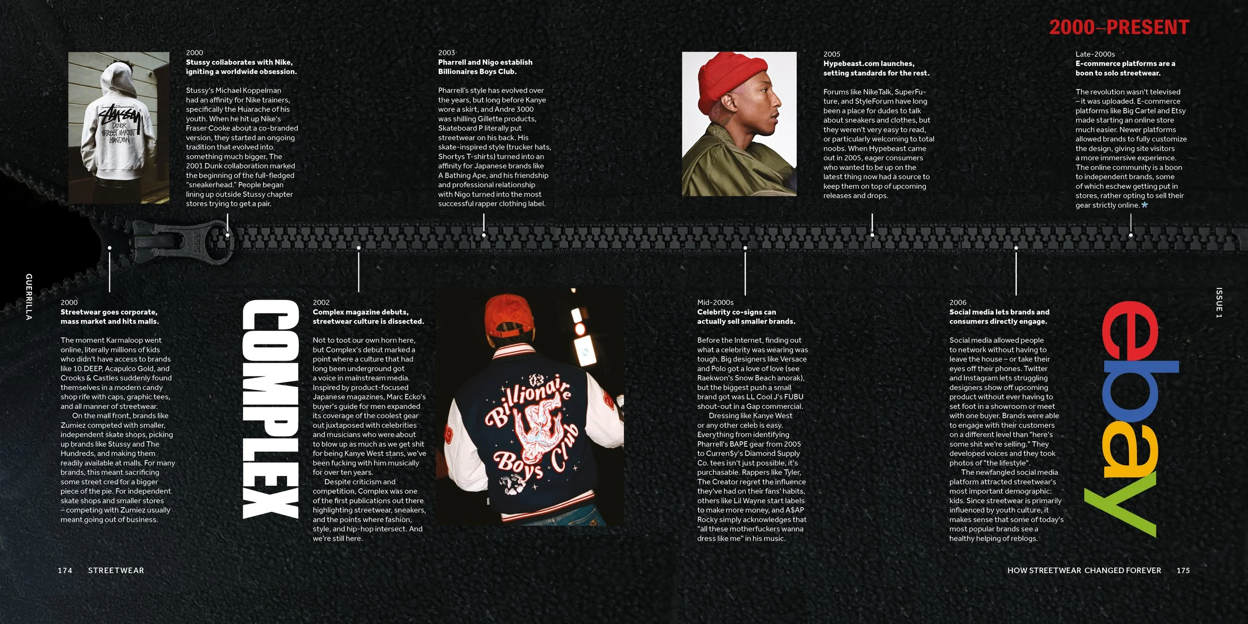
The magazine features 168–212 pages per issue. Every issue has a main brand that is explored which is represented on the cover, they are also given the feature article in the magazine. The articles are easy to read and are accompanied by strong, high-quality imagery. From article to article, there are many differences in pacing and image use, allowing the reader to have breaks without being bored by a certain type of content.

*GUERRILLA Magazine: Inside spread
The magazine uses a 12-column grid system allowing for a lot of flexibility when deciding on text and image placement.

*GUERRILLA Magazine: Inside spread

*GUERRILLA Magazine: Inside spread


*GUERRILLA Magazine Issue 1